What is emite Advanced Visualization?
emite Advanced Visualization is a no-code enterprise dashboard platform that renders real-time and historical data on the same canvas. It receives governed, cross-source data from emite Advanced iPaaS and Advanced Analytics and turns it into live dashboards, wallboards, and scheduled reports — without code or a separate BI team.
How is emite Advanced Visualization different from traditional BI dashboard tools?
Most dashboard tools visualize a snapshot of data that’s already been prepared elsewhere, and treat real-time and historical views as separate modes. emite combines live streaming data and historical trend analysis in a single view, inherits governed KPI definitions automatically, and connects every dashboard directly to AskEmite for natural-language follow-up questions.
What data sources can emite Advanced Visualization display?
Any source connected through emite Advanced iPaaS — REST APIs, databases, cloud platforms, streaming services like Kafka and Kinesis, and SaaS systems such as Genesys, Amazon Connect, Salesforce, and ServiceNow. Because iPaaS is connector-less, new sources can appear on dashboards without waiting on a vendor connector.
Does emite Advanced Visualization require coding to build dashboards?
No. Dashboards are built with a no-code, drag-and-drop interface, so business users can create, adjust, and publish views without developer or BI specialist support — while still inheriting governed, consistent KPI logic underneath.
How does emite Advanced Visualization handle real-time versus historical data?
Both live on the same canvas rather than in separate tools or modes. Teams can monitor what’s happening right now — queues, SLAs, agent performance — while layering in historical trends to understand root causes and long-term patterns, without switching platforms.
How does emite Advanced Visualization connect to AskEmite?
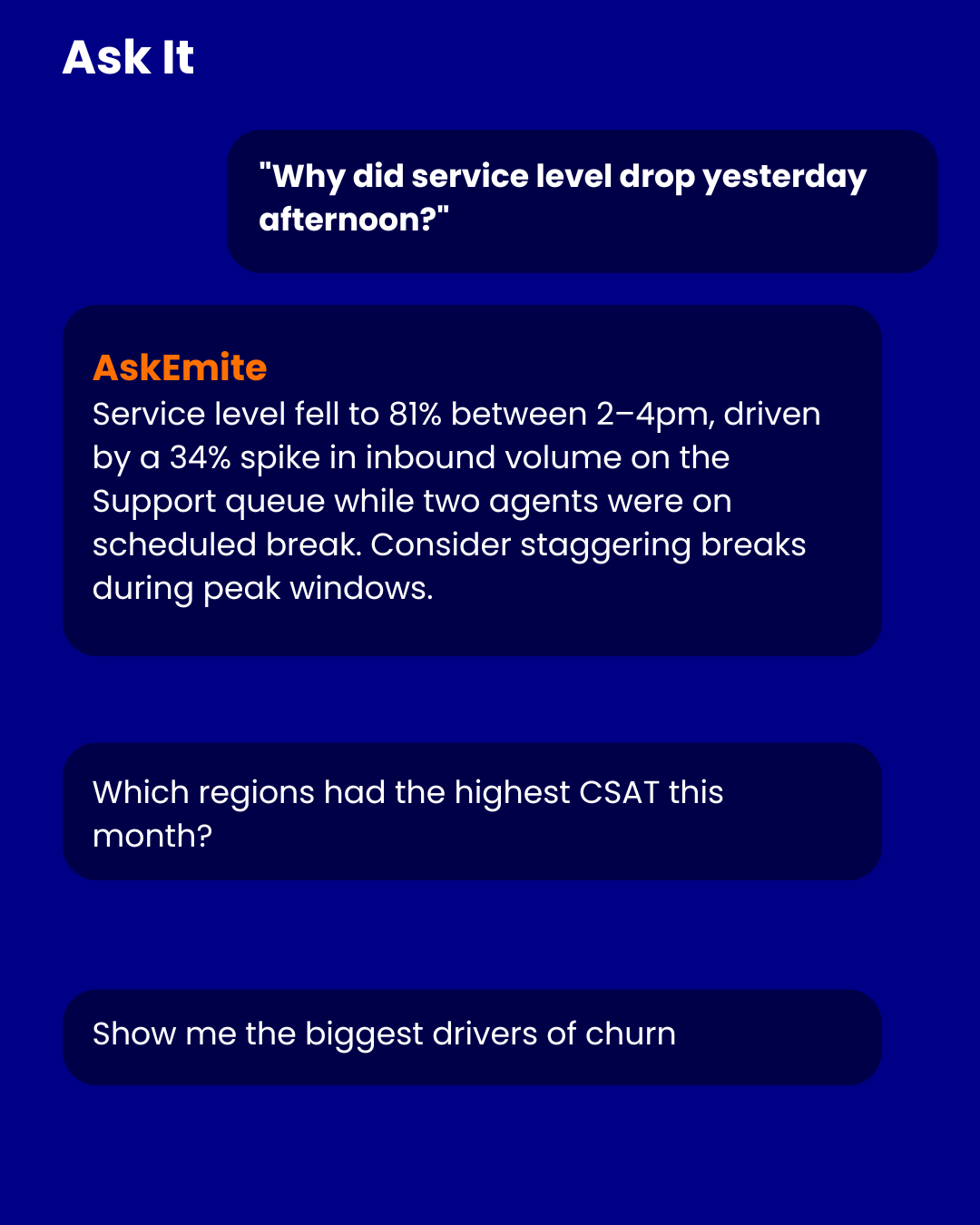
Every dashboard is a live entry point into AskEmite. Instead of building a new report to understand why a number changed, users can ask a plain-language question directly from the dashboard and get an explainable answer grounded in the same governed data already on screen.
Can dashboards be customized by role, region, or department?
Yes. emite supports role-based, permission-controlled views, so executives, managers, and frontline teams see the metrics relevant to them, in their own language where needed, while everyone works from the same underlying governed data.
How does emite Advanced Visualization ensure dashboards don’t show conflicting numbers?
Every dashboard inherits its KPI definitions directly from emite Advanced Analytics rather than defining metrics locally. That means a metric means the same thing on every dashboard, for every team, eliminating the definition drift common in traditional BI tools where each workbook can calculate a metric slightly differently.
How does emite Advanced Visualization fit with the rest of the emite platform?
It’s the visualization layer of the emite Digital Intelligence Platform: emite Advanced iPaaS unifies the data, Advanced Analytics computes governed KPIs from it, Advanced Visualization renders that into dashboards and wallboards, and AskEmite lets anyone question what they’re seeing in plain language — one continuous flow from integration to insight to action.