BLOG
Why Most Contact Centre Dashboards Fail
And What to Do About It
You can’t improve what you can’t explain.

Walk into almost any contact centre operations room and you’ll see them: wallboards glowing with real-time stats, KPI dashboards refreshing every few seconds, weekly reports landing in inboxes like clockwork. By every visible measure, the modern contact centre has never had more data.
So why do so many leaders still struggle to answer the most basic question of all, why is this happening?
The uncomfortable truth is that most contact centre dashboards fail, not because they’re poorly built, but because the questions leaders are asking have outgrown them.
Dashboards do exactly what they were built to do: show you what’s happening, accurately and in real time. But the job has changed. Leaders no longer just need to see performance, they need to explain it, predict it, and act on it.
Here’s why that gap exists, and what the next generation of contact centre intelligence looks like.
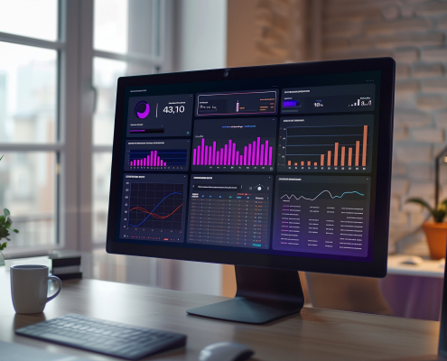
A dashboard is a mirror.
It reflects your operation back at you: abandonment is up 12%, AHT has crept past target, NPS dipped three points last month.
Useful, yes. Actionable? Rarely.
Because the moment a metric moves, the real work begins, and the dashboard steps aside. Someone has to pull call data, cross-reference rosters, check which queues were affected, compare team performance, and rule out a dozen possible causes. What should be a decision becomes an investigation.
Hours of one. Sometimes days.
Knowing your KPIs is not the same as understanding them. Visibility isn’t insight. And in a contact centre, where a single bad week can ripple through customer satisfaction, staffing costs and churn, that gap between seeing and explaining is expensive.
If you want a quick test of whether your reporting environment is genuinely helping you, try asking it these five questions.
If your current tools can’t answer these questions, you’re not alone. You’re simply experiencing the ceiling of dashboard-era reporting.
Your dashboard will confirm that it did. It won’t tell you whether the cause was a staffing gap on Tuesday morning, a broken IVR path, a marketing campaign that spiked volume, or something else entirely.
League tables show rankings. They don’t show whether Team B’s longer handle times reflect harder call types, a new starter cohort, or a coaching gap.
NPS is an outcome metric shaped by dozens of upstream factors. A dashboard shows the trend line; it can’t decompose it into causes you can act on.
Historical reporting is, by definition, backwards-looking. By the time churn shows up on a dashboard, the customer has already left.
This is the biggest gap of all. Dashboards were built to display data, not to recommend action. The “so what” has always been left to humans, working with fragments.

The average contact centre now runs telephony, CRM, workforce management, quality management and CX platforms side by side, often ten or more systems, none of which naturally talk to each other. Every dashboard shows a slice; nobody sees the whole picture. When each team works from a different slice, you don’t have one version of the truth. You have seventeen dashboards and nobody trusts any of them.
The instinctive response to “we can’t see what’s happening” has been to build more dashboards. But more screens don’t equal more understanding, they equal more places to look, more numbers to reconcile, and more time spent explaining discrepancies between reports instead of fixing problems.
Customer behaviour, channel mix and volume patterns shift faster than weekly reporting cycles. By the time a monthly report explains last month’s anomaly, this month has already produced two new ones.
The good news: the technology to close this gap now exists. The contact centre industry is at the beginning of a shift from reporting, displaying what happened, to decision intelligence: understanding why it happened and what to do next.
Decision intelligence looks fundamentally different from a dashboard:
Unified data, not siloed slices. Every source, telephony, CRM, WFM, CX, connected into a single real-time layer, so analysis reflects the whole operation, not one system’s view.
Questions in plain English, not query languages. Instead of waiting on an analyst or wrestling with report builders, leaders simply ask: “Why are calls taking longer in Team B?”, and get an answer grounded in the data.
Root cause in seconds, not hours. Analysis that would take an analyst half a day of cross-referencing is done automatically, across every connected source at once.
Anomalies surfaced before they escalate. Rather than waiting for you to notice a problem, the system flags unusual patterns as they emerge, including the ones you didn’t know to look for.
Recommended actions, not just insights. The end point isn’t a chart. It’s a clear answer to “what should we do next?”
This is the thinking behind AskEmite, not another dashboard, and not another chatbot, but an intelligence layer that lets contact centre leaders have a conversation with their data.


You don’t need to rip anything out tomorrow. But you do need to know where you stand. A useful first step is a structured review of your current reporting environment:
If the honest answers make you wince, that’s the point. You can’t improve what you can’t explain, and you can’t fix a reporting problem you haven’t measured.
Ready to find out how your reporting environment really stacks up?
Book a free DEMO with the emite team.
AskEmite can be deployed in hours not weeks – get the most out of your dashboards
RELATED RESOURCES


 The-Dashboard-Health-Assessment